
Understanding Flexible Grids and Breakpoints
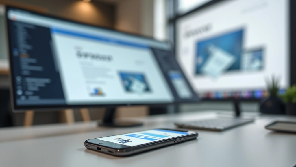
Learn how to structure layouts that adapt smoothly across devices. We’ll cover grid fundamentals and strategic breakpoint placement.
Read ArticleWhy starting small changes everything. This method forces cleaner thinking and produces better results. See how to implement it in your workflow.
Most designers still start their projects on desktop. They build the full-width layout first, then try to squish everything down for mobile. It’s backwards. And it shows.
Mobile-first design flips this approach. You start with the smallest screen — a phone at 320px wide — and build up from there. It sounds limiting. But it’s actually freeing. When you’ve got only 320 pixels to work with, you make better decisions. Every element has to earn its place. Nothing’s just decoration.
In Hong Kong, where most people browse on phones during their commute, this isn’t theoretical anymore. It’s essential. The designers winning projects understand this. Their sites load faster, perform better on mobile devices, and convert more visitors because they prioritized what matters first.
Build for the smallest screen first. Expand features as screen space allows. Never remove features when space gets tighter — that’s a red flag you’ve designed wrong.
This guide is educational material designed to help you understand mobile-first design principles and implementation strategies. It reflects current industry best practices as of 2026. Every project has unique constraints — adapt these approaches to fit your specific context and client needs. When in doubt, test with real users on actual devices.
You’re probably thinking: “Isn’t it just the same design at different sizes?” Not quite. Mobile-first changes how you prioritize. You’re forced to ask hard questions.

Here’s the thing that trips up most people: mobile-first isn’t just a mindset. It changes your actual CSS. You’ll use min-width media queries instead of max-width. You start with styles for small screens, then add more as space increases.
Your base styles target phones. Then at 768px (tablet), you add more columns. At 1024px (desktop), you add even more features. Each breakpoint is an addition, not a subtraction.
Pro tip: Start with viewport widths: 320px (small phone), 768px (tablet), 1024px+ (desktop). These breakpoints match real devices people use in Hong Kong.
Here’s how to actually start a project this way. It takes a bit of discipline at first, but it becomes natural fast.
Open your design tool and set the canvas to 320px wide. No shortcuts. This forces you to prioritize ruthlessly. Navigation becomes a menu. Sidebars disappear. Only essential content remains.
In CSS, write your base styles. No media queries yet. Typography, spacing, colors — all optimized for phones. Your HTML is lean. Your CSS is minimal. This is your foundation.
At 768px, you’ve got room for two columns. Add that. At 1024px, you’ve got room for more detail. Add that. Each breakpoint improves the experience without removing anything that worked at smaller sizes.
Don’t just use Chrome DevTools. Get actual phones. Test on a real iPhone 12. Test on an Android device. See how it feels to scroll, tap, and interact. This reveals problems no emulator catches.
The difference isn’t just philosophical. It shows up in your actual code and site performance.
In 2026, mobile-first isn’t a trendy approach. It’s how professional designers work. Your clients expect their sites to work beautifully on phones — because that’s where their customers are.
You’ll notice something after building a few projects this way: your code gets better. Your decisions get sharper. You stop adding unnecessary complexity. And your sites actually perform.
Start your next project at 320px. Design there. Build there. Then expand. You’ll see what we mean.
Explore more responsive design fundamentals to deepen your skills.
Browse Responsive Design Articles
Learn how to structure layouts that adapt smoothly across devices. We’ll cover grid fundamentals and strategic breakpoint placement.
Read Article
Both tools have their place. We’ll compare when to use flexbox for components and grid for page layouts.
Read Article
Emulators aren’t enough. Learn practical testing strategies for Hong Kong freelancers working with real clients.
Read Article