
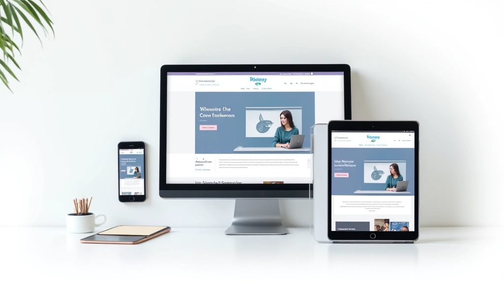
Mobile-First Design Approach
Why starting small changes everything. This method forces cleaner thinking and pushes better design decisions from the start.
Read ArticleLearn how to structure layouts that adapt smoothly across devices. We’ll cover grid systems, media queries, and practical breakpoint strategies that actually work.

Building responsive layouts isn’t just about making things smaller on mobile. It’s about creating a framework that feels natural at every screen size. A solid grid system is your foundation — it keeps elements aligned, maintains rhythm, and makes responsive design predictable instead of chaotic.
You’ll notice that successful websites don’t just shrink everything down. They rethink the layout at different screen sizes. That’s where flexible grids and breakpoints come in. They’re not fancy tricks — they’re the structural thinking that separates amateurish sites from ones that feel professionally designed.
Most responsive frameworks use a 12-column grid. Why 12? It’s divisible by 2, 3, 4, and 6 — giving you flexibility without complexity. A typical desktop grid spans 1200 pixels with 12 equal columns of 100 pixels each (plus gutters between them).
Here’s what actually matters: you define your grid width, set a gutter spacing (usually 15-20px), and then build everything in multiples of columns. A sidebar might take 4 columns, main content takes 8. On tablet, the sidebar could become full-width above the content. That’s the magic — the grid adapts, and everything reflows naturally.
Key principle: Your grid isn’t rigid — it’s a guide. You’re not forcing content into boxes. You’re using the grid to create harmony and predictability.

A breakpoint is where your layout changes. Don’t choose breakpoints based on device sizes — that’s backwards thinking. Devices change constantly. Instead, choose breakpoints based on when your content stops looking good.
Start with mobile-first CSS. Write styles for 320px (the smallest screen), then add breakpoints where the design breaks. You’ll typically hit your first major change around 640px (tablets in portrait), then again at 1024px (tablets in landscape), and 1440px (larger desktops). But honestly? It depends on your content.
The common approach uses three main breakpoints: 768px (tablet), 1024px (small desktop), and 1440px (large desktop). We’ve found that testing on actual devices — not just browser resizing — reveals where real problems happen.
Media queries are how you implement breakpoints in CSS. The syntax is straightforward, but the strategy matters. You’re not changing a few colors — you’re restructuring layouts, resizing typography, and adjusting spacing.
Write your default CSS for mobile (320px and up). No media query needed — this is your baseline.
At 768px, you’ll adjust grid columns, increase font sizes slightly, and rearrange multi-column layouts.
At 1024px+, expand whitespace, increase grid width, and introduce full-width sections where appropriate.
The key isn’t having many breakpoints — it’s having the right ones. Most projects only need 2-3 media queries to look great everywhere.
Educational Note: This article covers responsive design principles and best practices for web development. Implementation approaches may vary based on your specific project requirements, browser support, and performance considerations. Always test your layouts across real devices and browsers to ensure they meet your audience’s needs.
Theory is nice, but implementation is what counts. Here’s what we’ve learned from building responsive sites for years:
Don’t use fixed pixel widths for grid columns. Use percentages or flexbox. That way your grid scales fluidly between breakpoints. A column that’s 50% on mobile becomes 25% on desktop automatically.
Consistent spacing between columns isn’t just aesthetic — it’s functional. Use the same gutter (we typically use 20px) throughout your grid. This keeps everything visually coherent.
Don’t let your layout stretch infinitely on huge screens. Set a max-width (1200px is common) so text doesn’t become unreadable. Everything else can be flexible up to that limit.
Design with actual content, not placeholder text. Long headlines, short headlines, images — real content reveals layout problems that dummy text hides.
You don’t need complicated frameworks. Modern CSS (flexbox and CSS Grid) handles responsive layouts beautifully without extra dependencies. But a few tools help streamline the process.

Flexible grids and breakpoints aren’t complicated once you stop overthinking them. You’re really just answering one question at each screen size: “Does this layout still look good?” If the answer’s no, add a breakpoint and adjust.
The best part? Once you’ve built a few responsive sites with this approach, it becomes second nature. You’ll start seeing layouts as flexible systems instead of fixed designs. Your CSS gets cleaner. Your sites load faster. And users on any device get a solid experience.
Start with a 12-column grid, choose your breakpoints based on content, and test relentlessly. That’s it. You don’t need trendy frameworks or complex tools. Just solid structural thinking.