
Understanding Flexible Grids and Breakpoints
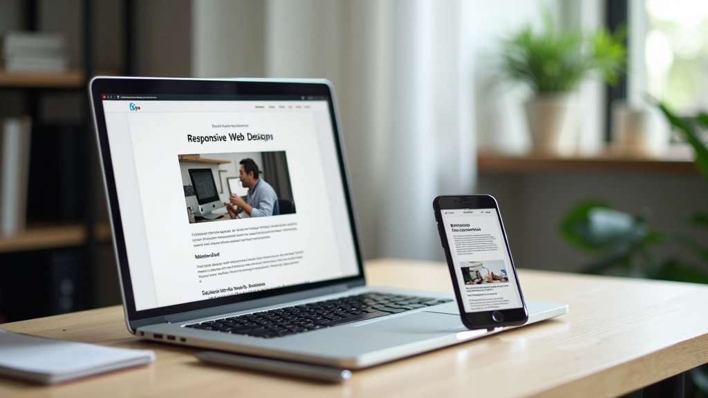
Learn how to structure layouts that adapt smoothly across devices. We’ll cover grid systems, media queries, and practical breakpoint strategies that actually work.
Read GuideLearn layout fundamentals that work everywhere — from Hong Kong to the world

We’re a team of designers and developers based in Hong Kong, teaching responsive design to freelancers who want to build better websites. We don’t do theory without practice — everything we teach comes from real projects.
Our mission? Help freelancers understand layouts that actually work. Responsive design isn’t magic. It’s a skill you can master with clear guidance and hands-on practice.
Learn our full story


We don’t skip the basics. Flexible grids, media queries, and breakpoint strategy — you’ll understand each piece before moving forward. No shortcuts, no magic tricks.
Confusing tutorials waste your time. We’ve simplified responsive design into digestible lessons you can apply immediately to your own projects.
Each module includes real-world exercises. You’ll build actual layouts, not just read about them. That’s how skills stick.
When you design for small screens first, larger screens follow naturally. We’ll show you why this approach works and how to use it in every project.

“I wasn’t confident about responsive design before taking these courses. But the step-by-step approach made it click. Now I’m actually proud of the layouts I’m building. My clients notice the difference too.”
— Jennifer, Hong Kong freelancer
“The thing I appreciated most? No fluff. Just practical knowledge I could use in my next project. That’s rare.”
— Marcus, freelance designer
“CSS Grid vs Flexbox module was a game-changer. I finally understand when to use each one. Saved me hours on recent projects.”
— Sofia, web developer
Started teaching responsive design basics to local freelancers. Realized there was a gap between generic tutorials and practical, real-world training. Decided to fill it.
Built our core 8 modules based on feedback from hundreds of freelancers. Added practical projects and real portfolio examples. Launched our online platform.
Continuously updating content as web standards evolve. Now serving freelancers across Asia with our comprehensive responsive design courses. Still learning, still improving.
Top Design Education 2024
Industry Certified Curriculum
1000+ Success Stories
97% Course Completion


Start with these essential reads on responsive layout fundamentals
Learn how to structure layouts that adapt smoothly across devices. We’ll cover grid systems, media queries, and practical breakpoint strategies that actually work.
Read Guide
Why starting small changes everything. This method forces cleaner thinking and produces better results. See how to implement it in your workflow.
Read Guide
Both tools have their place. We’ll compare when to use flexbox for components and grid for page layouts. Includes real project examples.
Read GuideJoin hundreds of freelancers who’ve mastered responsive design. Start with our foundational modules and build skills you’ll use on every project.